Build fully functional accessible web applications faster than ever – Mantine includes more than 120 customizable components and hooks to cover you in any situation
Free and open source
All packages have MIT license, you can use Mantine in any project
TypeScript based
Build type safe applications, all components and hooks export types
No annoying focus ring
Focus ring will appear only when user navigates with keyboard
Explore examples
Core components library
Mantine core library includes all essential components: inputs, buttons, modals, popovers, typography elements, layout management, etc.
Radio group
Slider and RangeSlider
xs
sm
md
lg
xl
Theming
Extend default theme with any amount of additional colors, replace shadows, radius, spacing, fonts and many other properties to match your design requirements.
Mantine theme is just an object, you can subscribe to it in any part of application via context and use it to build your own components.
Learn more about themingBright pink badge
Dark theme
Add dark theme to your application with just a few lines of code – Mantine exports global styles both for light and dark theme, all components support dark theme out of the box.
Learn how to setup dark theme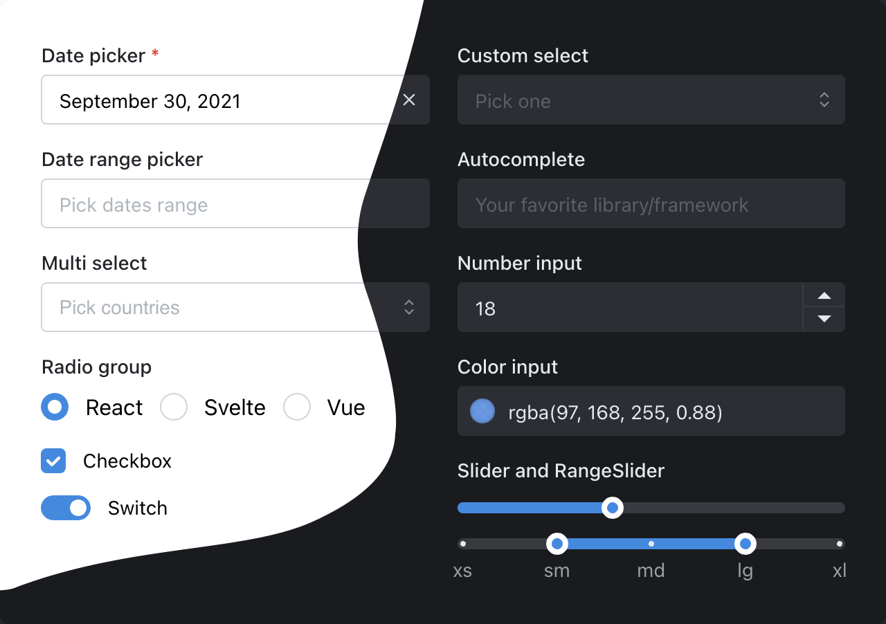
Hooks library
Mantine comes with more than 30 hooks to manage state and UI to help you build custom components.
All hooks that are used to build Mantine components are exported from @mantine/hooks package, hooks do not depend on components packages, you can use them independently in any react application.
use-scroll-lock hook
use-click-outside hook
Transitions API
Animate presence with premade transition or build your own animation with simple API, all Mantine components support custom transitions
Learn more about Transition componentUse premade transitions with any component
fade
scale
scale-y
scale-x
skew-up
skew-down
rotate-left
rotate-right
slide-down
slide-up
slide-left
slide-right
pop
pop-bottom-left
pop-bottom-right
pop-top-left
pop-top-right
Or create your own transitions
Notifications system
A fully featured notifications system integrates seamlessly with your Mantine theme.
Get started with @mantine/notificationsRich text editor
A Quill.js based rich text editor: handles images uploads, supports embedded video, integrates seamlessly with your Mantine theme
Get started with @mantine/rteExplore Mantine UI
Mantine UI is a set of more than 120 responsive components built with Mantine. All components support dark/light color scheme and Mantine theme customizations. Mantine UI is free for everyone.
Components customization
Each Mantine component supports styles overriding for every internal element inside with classes or inline styles. This feature alongside other customization options allows you to implement any visual modifications to components and adapt them to fit almost any design requirements.
Default slider styles
20%
50%
80%
Find elements that you need to change in styles API table
| Name | Description |
|---|---|
| root | Root element |
| track | Track element, contains all other elements |
| bar | Filled part of the track |
| thumb | Main control |
| dragging | Styles added to thumb while dragging |
| label | Label element, displayed above thumb |
| markWrapper | Wrapper around mark, contains mark and mark label |
| mark | Mark displayed on the track |
| markFilled | Styles added to mark when it is located in filled area |
| markLabel | Mark label, displayed below track |
Use anywhere
Mantine works in all modern environments – get started instantly with Next.js, Gatsby.js, create-react-app, Vite or Remix by following getting started guide:
Join the community
Mantine has a very friendly community, we are always open to new ideas and feedback. Join us on Discord or GitHub Discussions to get any kind of help or on Twitter to get notified about releases.