Card

Card with context styles for Image and Divider components
Import

Usage

Card component is a wrapper around Paper component with context styles for Card.Section component:
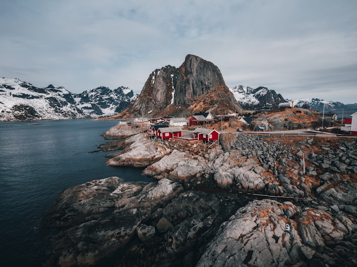
Norway
Norway Fjord Adventures
On Sale
With Fjord Tours you can explore more of the magical fjord landscapes with tours and activities on and around the fjords of Norway
import { Card, Image, Text, Badge, Button, Group, useMantineTheme } from '@mantine/core';
function Demo() {
const theme = useMantineTheme();
const secondaryColor = theme.colorScheme === 'dark'
? theme.colors.dark[1]
: theme.colors.gray[7];
return (
<div style={{ width: 340, margin: 'auto' }}>
<Card shadow="sm" p="lg">
<Card.Section>
<Image src="./image.png" height={160} alt="Norway" />
</Card.Section>
<Group position="apart" style={{ marginBottom: 5, marginTop: theme.spacing.sm }}>
<Text weight={500}>Norway Fjord Adventures</Text>
<Badge color="pink" variant="light">
On Sale
</Badge>
</Group>
<Text size="sm" style={{ color: secondaryColor, lineHeight: 1.5 }}>
With Fjord Tours you can explore more of the magical fjord landscapes with tours and
activities on and around the fjords of Norway
</Text>
<Button variant="light" color="blue" fullWidth style={{ marginTop: 14 }}>
Book classic tour now
</Button>
</Card>
</div>
);
}

Card.Section

Card.Section is a special component that is used to remove Card padding from its children while other elements still have horizontal spacing. Card.Section works the following way:

  • If component is a first child in Card then it has negative top, left and right margins
  • If it is a last child in Card then it has negative bottom, left and right margins
  • If it is in the middle then only left and right margins will be negative
<Card p="xl">
{/* top, right, left margins are negative – -1 * theme.spacing.xl */}
<Card.Section>First section</Card.Section>
{/* Content that is not inside Card.Section will have theme.spacing.xl spacing on all sides relative to Card */}
<Text>Some other content</Text>
{/* right, left margins are negative – -1 * theme.spacing.xl */}
<Card.Section>Middle section</Card.Section>
{/* bottom, right, left margins are negative – -1 * theme.spacing.xl */}
<Card.Section>Last section</Card.Section>
</Card>

Note that Card relies on mapping direct children and you cannot use fragments or others wrappers for Card.Section:

<Card p="xl">
<div>
<Card.Section>Won't work</Card.Section>
</div>
<>
<Card.Section>Won't work either</Card.Section>
</>
<Card.Section>Works fine</Card.Section>
</Card>

Custom root element

You can set component prop on Card to use provide custom root element, for example, you can make whole card a link:

import { Card, Image, Text } from '@mantine/core';
function Demo() {
return (
<Card
shadow="sm"
p="xl"
component="a"
href="https://www.youtube.com/watch?v=dQw4w9WgXcQ"
target="_blank"
>
<Card.Section>
<Image src="unsplash.png" height={160} alt="No way!" />
</Card.Section>
<Text weight={500} size="lg">
You've won a million dollars in cash!
</Text>
<Text size="sm">
Please click anywhere on this card to claim your reward, this is not a fraud, trust us
</Text>
</Card>
);
}

You can also use React component instead of an element, for example, Link from react-router-dom:

import { Link } from 'react-router-dom';
import { Card } from '@mantine/core';
function Demo() {
return <Card component={Link} to="/my-route/" />;
}

To use custom component with TypeScript provide type:

import { Card } from '@mantine/core';
import { Link } from 'react-router-dom';
function Demo() {
return (
<>
<Card<'a'> component="a" href="#" />
<Card<typeof Link> component={Link} to="/hello" />
</>
);
}

Custom Card.Section root element

Card.Section root element can be changed the same way as with Card:

Norway
Norway Fjord Adventures
On Sale
With Fjord Tours you can explore more of the magical fjord landscapes with tours and activities on and around the fjords of Norway
import { Card, Image, Text, Badge, Button, Group, useMantineTheme } from '@mantine/core';
function Demo() {
const theme = useMantineTheme();
const secondaryColor = theme.colorScheme === 'dark' ? theme.colors.dark[1] : theme.colors.gray[7];
return (
<Card shadow="sm" p="lg">
<Card.Section component="a" href="https://mantine.dev" target="_blank">
<Image
src="https://images.unsplash.com/photo-1527004013197-933c4bb611b3?ixid=MnwxMjA3fDB8MHxwaG90by1wYWdlfHx8fGVufDB8fHx8&ixlib=rb-1.2.1&auto=format&fit=crop&w=720&q=80"
height={160}
alt="Norway"
/>
</Card.Section>
<Group position="apart" style={{ marginBottom: 5, marginTop: theme.spacing.sm }}>
<Text weight={500}>Norway Fjord Adventures</Text>
<Badge color="pink" variant="light">
On Sale
</Badge>
</Group>
<Text size="sm" style={{ color: secondaryColor, lineHeight: 1.5 }}>
With Fjord Tours you can explore more of the magical fjord landscapes with tours and
activities on and around the fjords of Norway
</Text>
<Button variant="light" color="blue" fullWidth style={{ marginTop: 14 }}>
Book classic tour now
</Button>
</Card>
);
}